Data Visualization in R!
Welcome to a beginners guide to creating figures in R!
Being able to appropriately display your data in clean and clear figures is an important skill. In this post we will go over how to use ggplot in R to make bar charts, line graphs, box plots, and scatter plots.
Before getting started, make sure that you have installed “tidyverse” and “ggplot” or “ggplot2”. If you are using GitHub you can also choose to install “devtools”.
Types of figures
Bar charts
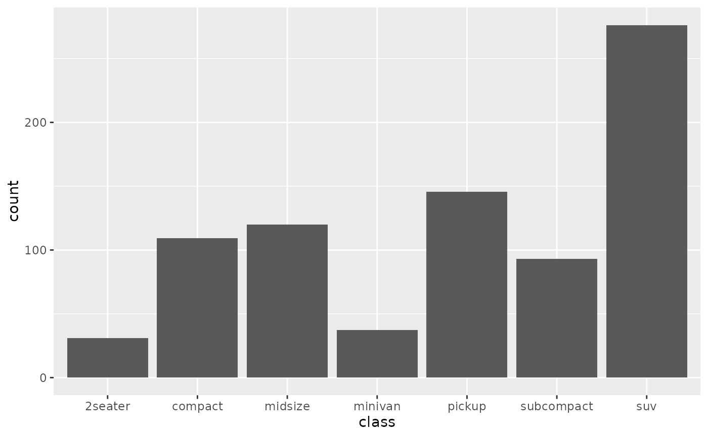
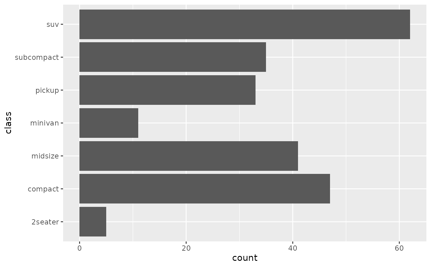
Bar charts are great for representing categorical data. For example, organizing your results into groups by sample type, sample origin, or experimental results. Bar charts represent average counts and are useful in showing comparisons among discrete variables as opposed to continuous variables.
Example
You can choose to represent the data with either horizontal or vertical columns depending on the range size. I recommend that for large datasets with numerous independent variables a horizontal bar chart is used and for data with less than ten discrete variables, a column bar chart is used.
Line Graphs
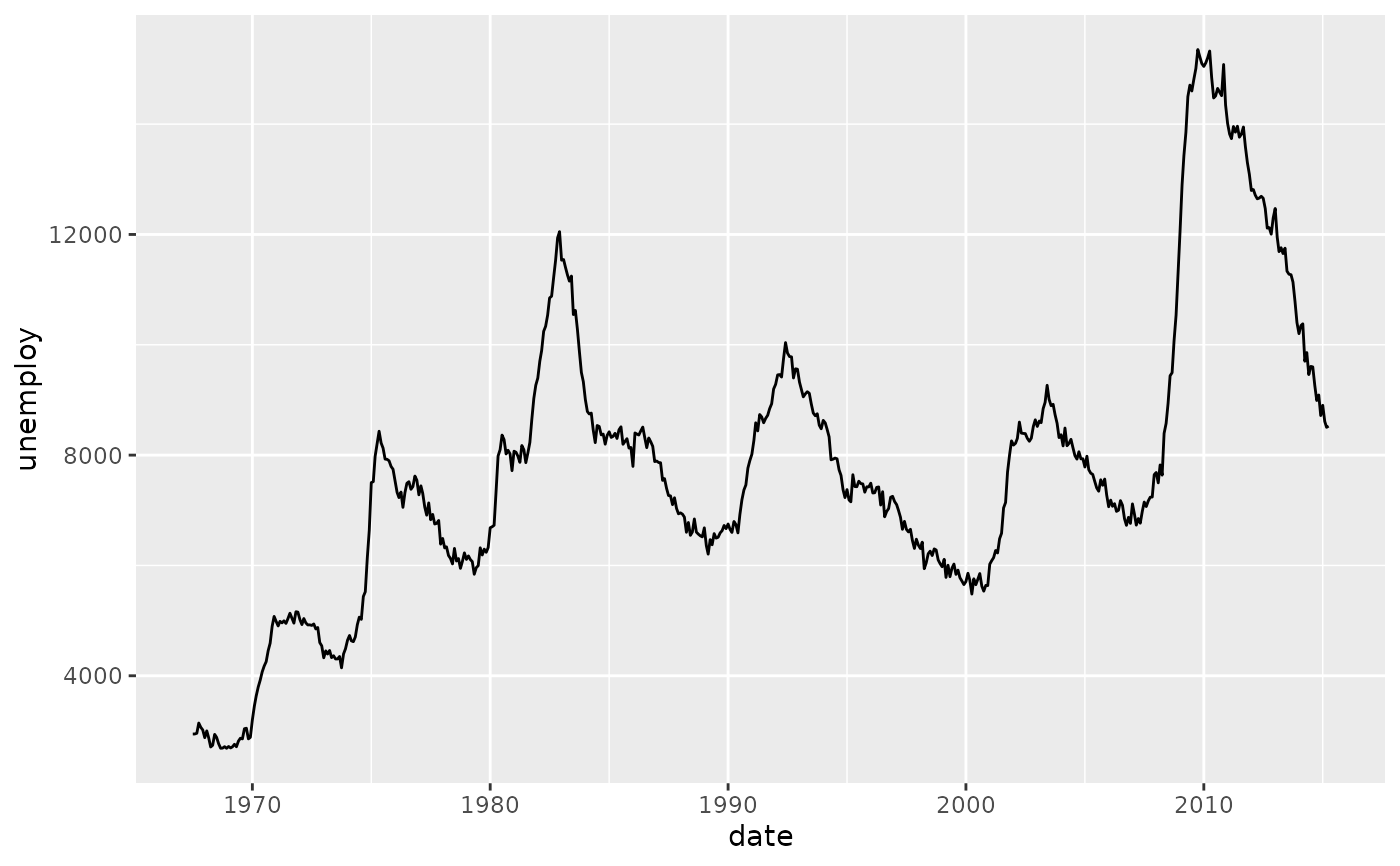
Line graphs a traditionally a good representation of continuous data, for example, results over time. Another common use for a line graph would be to plot a trend line or standard curve.
Example
Unlike bar charts where the independent variable may go on either the x-axis or y-axis, line graphs exclusively place the independent variable on the x-axis.
Box Plots
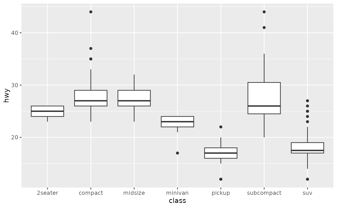
Box plots are very useful when a scientists is trying to demonstrate distributions. These plots show the density distribution, the mean, max, and minimum. Additionally, customization allows the user to exclude outliers in these calculations while still including them on the plot. A common alternative to a box plot is a violin plot.
Example
Box plots and violin plots can be customized to include or exclude outliers when representing the density distribution.
Scatter/Point Plots
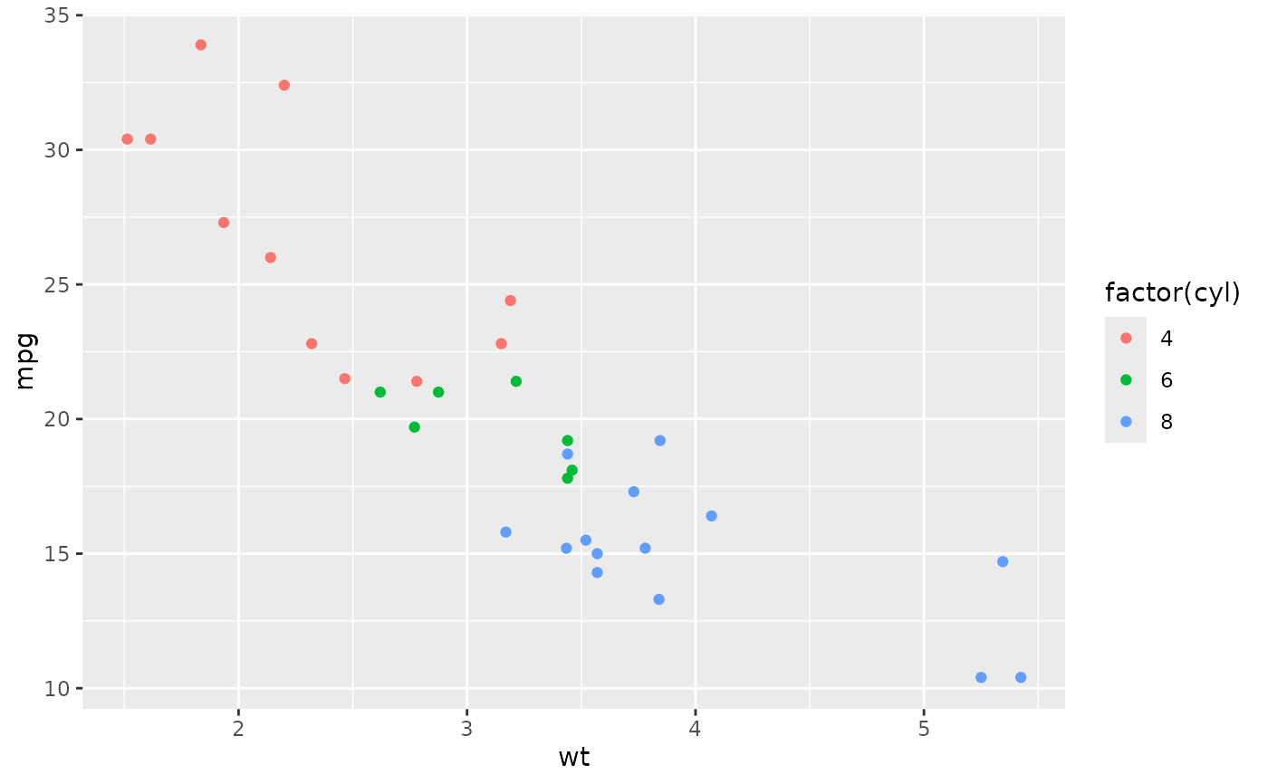
Scatter plots are optimal for data that you have many data points for which an average does not make sense but you would like to highlight specific grouping or trends.
Example
Using ggplot
ggplot is a data visualization system from tidyverse that takes input data sets and creates customizable graphics. For information beyond this post and user guides, github provides a ggplot overview. Prior to running any script you will have to load the library for ggplot or ggplot2. Note that this is different than installing the packages.
To do this: library(ggplot2)
Writing a script and data input
The general format of a ggplot input is as follows:
name_of_plot <- ggplot(data = data_source,
                       aes(x = geo_type,
                           y = n,
                           fill = actual_data_to_plot)) +
  geom_col(position = position_dodge()) +
  labs(title = paste("Your title here",
                     dynamic_input),
       x = "Type of area",
       y = "Number of areas")
Saving a ggplot to a file:
ggsave(plot = name_of_plot,
       filename = paste0("data directory",
                         core_name,
                         "file_name.png"))
Finally, in R, if you want to see the generated figure without opening the saved file, you just call the plot name at the end of the script:
name_of_plot
Interpreting the script above based on inputs and commands:
data =- Here we are calling the dataset we want to use for the plot. The data set should be a csv or txt file that has already been read into the script and is called as a variable in this section of the plotting code.
aes- This is where you specify how data is being plotted. Which data is going on the x, which data is going on the y. You can also opt to select for color, size, and and data point shape or transparency (depending what type of plot you choose these options differ slightly).
- Within
aesyou a can also add a fill. You can use this when you are comparing two independent variable that have been grouped:ggplot(aes(x = city, y = count, fill = type))
- Alternatively, you can also choose to identify different groups by using multiple colors based on the group ID:
ggplot(aes(x = independent_variable,
y = dependent_variable)) +
geom_boxplot(aes(color = independent_variable))
geom_col(aes(color = flower_type))- In this example we are determining the type of figure to make,
geom_colcreates a column bar plot with the independent variable on the x-axis.
- Substitute
geom_pointfor a scatter plot - Example:
ggplot(aes(x = independent_variable, y)) + geom_point() + labs(title = "Title", x = "Independent Variable") - Substitute
geom_histogramfor a histogram:- Example: (note theres is only an x input)
ggplot(aes(x = independent_variable,
y = dependent_variable)) +
geom_histogram() +
labs(title = "Title",
x = "Independent Variable")
- Example: (note theres is only an x input)
- Substitute
geom_boxplotfor a box plot- Example:
geom_boxplot(aes(color = transportation_type)) +
labs(title = "Title",
x = "Independent Variable",
y = "Dependent Variable")
- Example:
- Substitute
geom_linefor a line graph- Example:
ggplot(aes(x = independent_variable,
y = dependent_variable)) +
geom_line() +
labs(title = "Title",
x = "Independent Variable",
y = "Dependent Variable")
- Example:
- In this example we are determining the type of figure to make,
position =- In this sample script,
position_dodgewas used to group the bar plot by category. Depending on your ultimate figure goal, this may not be necessary for all bar plots. Occasionally a stacked position, the default, is better when using a grouped dataset.
- In this sample script,
labs- Axis labels, can be set
title,x =, andy =
- Axis labels, can be set
- In
ggplotto continue adding input, each section has to be connection with a ‘+’.- Other input options could be the following:
scale_fill_gradient(low = "color1", high = "color2"): color 1 and color 2 are up to you to choose with in a ggplot color scheme. This function can be used when you selected a ‘fill’ option for grouped variables.ggthemesis a package that can be used as well for additional customization, some example include:theme_few()will remove the gray background from plots as well as the gridtheme(axis.text.x = element_text(angle = 0-180))will rotate the text on the x axis between 0 and 180 degrees. The same can be done for values on the y axis.
Customizing
Beyond the type of figure you are creating, there are additional commands to create more detailed figures. Additionally, there are customizations such as color scheme, background color, font size etc.
- Use
geom_errorbar()to add errorbars - Data point customization:
geom_point()- shape
- size
- color
- Color scheme - Classic colors can be chosen by defining variables with a specific color, but you can also import/call a color palette. These palettes are not only aesthetically pleasing but are also functional because they avoid the red/green color blind spectrum. Once a palette is chosen, you can organize your legend based on categories or input.
- Figure ‘theme’ - Much of the customization after you have settled on a form of data visualization and are happy with the color and fine details falling in the
themecategory.ggplotandtidyversegive users full range of control in deciding how the final output will look. Withtheme()you can decide where to put the legend, what sort of fill is in the legend background, the background/grid of the figure, and the position of axis titles.
References
- On bar charts
- On line graphs
- On box plots
- On scatter/point plots
- On ggplot and tidyverse